Adult coloring looks simple until you sit down with a detailed page and a box of pencils and wonder where to start. Which tools should you use? Why does the color look patchy? Why did the marker show through to the other side? None of it is complicated, and a few basics make the whole experience more relaxing and the results much better.
Choosing your tools
You don’t need expensive supplies to start. It helps to understand what each type does well.
Colored pencils
Pencils are the most forgiving choice for beginners. You can build color gradually, blend shades and correct small mistakes. Softer pencils lay down color more easily and blend well. Harder pencils hold a sharp point for tiny spaces. A mid-range set is plenty to begin.
Markers
Markers give bright, even color quickly, which is great for large areas. Water-based markers are easy to find and less likely to bleed. Alcohol-based markers blend beautifully but soak through most paper, so they need care (more on that below).
Gel pens and fine liners
Gel pens are good for small details, highlights and adding shine or sparkle on top of other colors. Fine-tipped pens help with tiny shapes in intricate designs.
Avoid bleed-through
Ink that soaks through can ruin the design on the other side of the page. Two simple habits prevent it:
- Test your tools first. Use a blank page or the inside cover to see how each marker or pen behaves on the paper.
- Put a spare sheet behind the page you are coloring, especially when using markers.
Books printed on one side only, with a blank back behind each design, make this much less of a worry.
Picking colors that work together
Choosing colors can be the most enjoyable part, and also the most paralyzing. A few easy approaches:
- Neighbors on the color wheel (like blue, teal and green) feel calm and connected.
- Opposites on the color wheel (like blue and orange) create contrast and make parts of the design stand out.
- A limited palette of three to five colors is easier to manage than the whole box and often looks more finished.
- Natural colors for the animal itself, with bold colors in the background patterns, is a simple way to make the subject stand out.
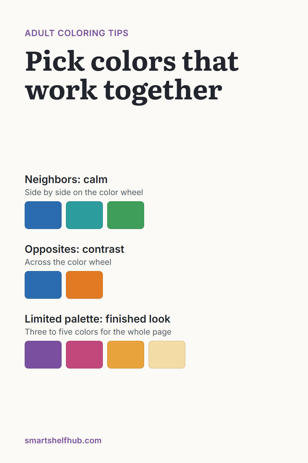
Before starting a detailed page, try your chosen colors side by side on scrap paper. It takes a minute and saves a lot of second-guessing.
Techniques that make a big difference
Work light to dark
With pencils, start with light pressure and build up color in layers. It is easy to add more color and hard to take it away. Many light layers look smoother than one heavy one.
Keep your strokes consistent
Patchy color usually comes from strokes going in different directions. Small, overlapping circles or short strokes in one direction give a smoother finish.
Add shading for depth
Pick a direction for your imaginary light source, such as the top left. Make the side of each shape away from the light a little darker. Even this one habit makes flat patterns look rounded and three-dimensional.
Blend two colors
To move from one color to another, layer them where they meet with light pressure, then go over the area again. A white or colorless blending pencil can help smooth the transition.
Leave some white
Not every space has to be filled. Small areas of white paper can read as highlights and give a busy design room to breathe.
How to approach a detailed page
Intricate designs can feel overwhelming. Breaking the page into parts helps:
- Choose your palette before you start.
- Color the main subject first, such as the animal’s face or body.
- Move outward to the larger patterns, then fill the background last.
- Take breaks. A detailed page doesn’t have to be finished in one sitting.
Starting in the center and working outward also keeps your hand from smudging finished areas.
Our coloring book mixes simpler and very detailed designs to practice this on: Animals Coloring Book: 50 Beautiful Animals
When something goes wrong
Mistakes happen on every page, and most of them can be rescued.
- A color went outside the line: extend that color into a nearby shape, or turn the spot into a deliberate detail like a dot or a leaf.
- A pencil area looks too dark: a kneaded eraser can lift some pigment if you press and lift rather than rub.
- You don’t like a color choice: layer a darker or complementary color over it to shift the tone, or let it be. From arm’s length, small “mistakes” usually disappear into the pattern.
Make it a calm habit
Many people enjoy coloring as a quiet way to slow down at the end of the day. Keep your supplies in one box, near where you like to sit, so getting started takes seconds. Choose simpler pages for tired evenings and detailed ones for a slow weekend afternoon. There is no wrong way to color a page, and no deadline.